Monday, March 31, 2014

Challenge #129 - Die-cuts

Milena
This week's challenge is to use a die cut on your project. Back when I started scrapbooking (14 years ago!!) I bought die cuts by the dozen. Now I have a Silhouette Digital Cutter and can cut pretty much anything I want. However, I don't often take the time to get it set up.

For this page I used some die cut flowers from the Teresa Collins He Said/She Said line and I used  my Silhouette to cut the title.  I really enjoy the titles that are available for purchase in the Silhouette store.


 I don't have any die-cuts embellishments pack, but I love to use my Big Shot to make my owns ! Sometimes, I cut them but they don't fit my layout, so I put them aside in my "everything-and-nothing" box (I can't throw away anything...). But this box was very full... Time to use it !
For my layout, I decided to make a decorative border with only die-cuts from my "everything-and-nothing" box. I chose them in the same color palette than my layout. Some are cut into paper, others into cork, glittered paper, vellum or fun foam. My title is also cut with dies, and I added some Stickles on it.


(The title means "Spring at Granny's home").


Lynne

I too have not used diecuts in years so this was a stretch for me.  And, to make matters worse, I do not own a die cut machine.  So I scrounged around my stash, and found that wonderful 12 inch musical note border from Queen & Co.  (No clue how old it is).   I added some musical embellishment stickers from Jolee's.  The large photo is from the Internet of The Piano Guys (check them out on their YouTube channel, if you have not heard of them before.)  My daughter and fiance took me to a belated Chanukah present concert this past Friday night.


Amanda

Since I learnt about Cricut Craft Room I have begun to use my Cricut so much more! I love that I can blend the letters together in Craft Room and it cuts them as a word, rather than individual letters! Makes it so much easier to adhere! I love die cutting my titles because then I never have to worry about having the perfect size or color of letter stickers and I never run out of vowels! For this layout I used the cartridge Jasmine to cut my title and date out and Creative Memories Reminisce Accents for my flowers which I then attached with pop dots to make them stand out.


Tammy

I am totally in the mood for spring.  With all the snow that we have been having here, I want spring colors and spring symbols, so I created this card with both of those in mind.  I used a Stampin Up butterfly die for this card.


Barb
I 've been using die cuts more and more on my pages since I got my Silhouette.  On this page I used stars and note die cuts.


Sunday, March 30, 2014

Highlights - Challenge #128 - Ink

There were so many fabulous entries this week! I am glad to see so many people participating despite many people mentioning that inking is not their cup of tea! A few highlights from this week...

Viv


Sylvia


Carol C


Don't forget to grab your badge ladies!


Thanks again to everyone who participated!

Monday, March 24, 2014

Challenge #128 - Ink

Amanda

This week's challenge is to use some ink on your project! There are so many types of ink products out there now and so many ways to use it! On this layout I used ink to distress the edges of several of the pieces of paper, to mist my background, to stamp my title and finally I also used alcohol inks to change the colour of the metal hearts.


Isbaha
I love to use ink for making embellishments but I decided to try something new, thanks to Amanda's challenge ! I am usually not really comfortable with inked background in a messy way, so
I used a step-by-step on Let's talk layouts blog (I subscribe to this french magazine, but these explanations are in the free download) and I'm very happy with how it turned !


Lynne

I too am not a fan of inking.  I don't like the mess to clean up, but a challenge is a challenge, so I inked the wood veneer letters from my humongous stash and added pen (ink?) stitching.  


Barb
As usual, I'm a little late to the party. It seems that I just can't get my act in gear these days.
For this challenge I used ink mists on this layout. I wanted the monochromatic feel so I tried to keep all the colours muted.


Milena
And I am even later to the party!!! I use inks on a lot of my pages but mostly to add a bit of depth around the edges of embellishments. That's just what I did here. It's subtle but I think it makes a big difference.


Sunday, March 23, 2014

Highlights - Challenge #127

Thank you everyone for playing along with us this week.  Here are a few of highlights from this weeks challenge that caught my eye.  Don't forget to grab your badge and thank you again.

Leslie Turner


Ellapu


Susan Kennedy


Monday, March 17, 2014

Challenge #127 - Monochromatic Green

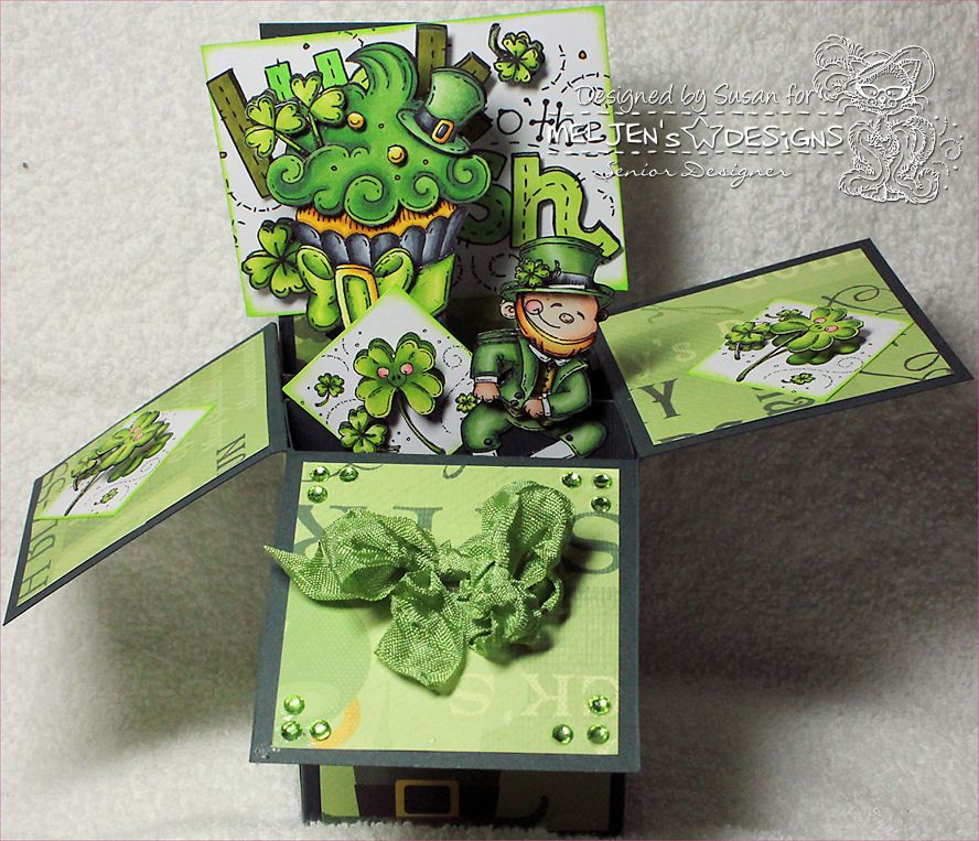
Hi all!  Lynne here.  Color challenges are one of my favorite, especially monochromatic colors.  In honor of St. Pat's Day this week, I chose to go with just GREEN.  Use as much green as you can muster.
I browsed through all my stash, which in itself could take hours, and came up with so many green scraps to use.  I look forward to see what you can come up with.  It is such a nice spring color, isn't it!


Monochromatic layouts are really a challenge for me ! This week, I also decided to make my background myself with white cardstock (tutorial on my blog). This is not what I used to do, but sometimes, it's nice to try something new, and for me, using only one color certainly is !


Amanda
Monochromatic layouts are fun to do but they can definitely be a challenge! I had never done a green one before! This is one of my silly dogs - sitting behind the wheel of my car a few years ago.


Tammy
I love green.  It's my most favorite color ever, so it was such fun to create a card using nothing but this color.  I decided to go with a sympathy card.  I don't have that many of them, and I though the green color would portray a calming effect in a time of sorrow.


Sunday, March 16, 2014

Highlights - Animal Challenge

WOW!!!

What a response we had this week. I want to thank everyone out there who participated in this weeks challenge. The link ups were overwhelming and choosing just 3 to highlight was definitely not an easy task.

A huge thank you too, to my Use Your Stuff team members for taking over the commenting for this week. I was on a cruise ship in the middle of the Gulf of Mexico without any internet. Poor me!! LOL

The highlights for this week include:

I just love the look on this little kitty's face and the over sized bow on the top.

I really like the bright orange on this tag and the funky owl perched in the middle.

I really like the use of hexagons and the popped out owl. I also think the title of this page is so appropriate.


Again, a huge thank you to everyone who participated this week. It was hard to choose just 3 highlights. 

Don't forget to grab your badge below!!


Monday, March 10, 2014

Challenge #126 - Animals

Hello everyone!

The challenge for this week is to incorporate ANIMALS into your project. The animal can be the topic or the embellishment.

Milena
I've had this page sitting on my desk waiting to be finished. We lost our Bella girl just a month ago to kidney failure and I thought this was a good way to celebrate her life.


I've had this house mouse image for awhile now, waiting to be colored.  I just thought that it would make a cute, simple Easter card.


When I read that this week's challenge was about "animals", I immediatly thought about this papers with lots of cute animals ! As I was browsing my photos to scrapbook, I found these ones from summer 2011, with my son on a big crocodile toy on the beach... It was a perfect match. My title reads "Riding the crocodile".


What animal will you feature this week? I can't wait to see what you come up with!!


Monday, March 3, 2014

#125 - Ad Challenge

Hello everyone. Welcome to a new week on the Use Your Stuff Blog.
This week we have an ad challenge for you. The challenge is to look at the ad and let it inspire your next project.

Here is the ad:


Based on this ad, I created this layout. First I created the right hand page to match the ad.


Since I'm scrapping a lot of travel layouts right now, and most of them are two-pagers, I then added my second page to match the first.


I love the way it turned out! I used the Simple Stories Vintage Bliss Collection that I purchased from Scrapbook Nerd .


  I loved the grid design of the ad and I decided it would be perfect for the first page of my 2013 "Month-in-review" album that  I still didn't make ! It was really fun to embellish each "square".


Lynne

This ad was wonderful inspiration.  I too liked the grid design, so I came up with this layout to highlight my great-nephew.  I love these ad challenges.  


Amanda

I am working on scrapping 2010 right now (I know...just a tad behind!) and I had all these photos from a Carrie Underwood concert that my husband and I attended. The ad was a perfect way to incorporate them all into two pages! All the titles are the songs she sang at the concert.


Milena
I really enjoy these ad challenges. What appealed to me about this one was the grid and the clean lines and simplicity of it. I have done a Project Life type album for the past 5 years but decided not to do one this year, however, I find I take lots of photos - mostly with my phone - that are not worthy of a full page but really represent our daily life. I used this ad to create a collage of those photos for the month of January. 


What does this ad inspire you to create this week. Don't forget to come back here and share your project.


Highlights Challenge #124

thank you ladies for playing along with my challenge last week.  What gorgeous projects you created.  Here are a few highlights


I love the soft colors of this card and such an amazing sentiment


I love the digital element of this layout. 


I love all the fun embellishments to highlight the City of Lights!

Thanks to everyone for playing along.
Don't forget to grab your badge for your blog!